

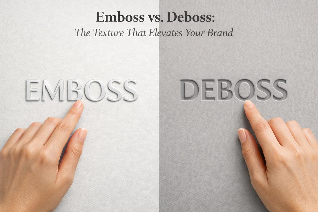
What’s the Difference Between Emboss and Deboss in Design?
The difference between emboss and deboss might sound like printer-shop trivia—until you’re staring at 10,000 custom cosmetic bags and your logo feels… flat. In the 2026 beauty retail landscape, texture talks. A raised mark can strut like it owns the room; a pressed-in logo whispers luxury. Pick wrong, and your brand’s big debut lands with a thud.
I once watched a buyer run her thumb across two samples like she was judging peaches at a farmers’ market. “This one feels expensive,” she said. That split-second reaction? That’s shelf power.
According to the McKinsey State of Fashion 2026 report, brands are increasingly engaging in “the elevation game” to move upmarket amidst macroeconomic volatility. With over 80 percent of consumers now citing value-for-money as a top buying factor, premium physical cues—like refined tactile packaging—have become essential to clearly articulate a brand’s value proposition and drive pricing power. Texture is one of those critical cues.
Choose wisely—your customers will feel the difference before they even look.
Reading Notes: Unveiling the Difference Between Emboss and Deboss
➔ Technique Essence: Embossing raises logos or patterns above the material surface; debossing presses designs into the substrate, creating recessed impressions.
➔ Material Compatibility: PU leather and nylon excel with embossing for bold texture; velvet and satin lend themselves to debossing for subtle, refined branding.
➔ Visual & Textural Impact: Embossing delivers pronounced, tactile depth that catches the eye; debossing offers understated elegance and smooth finishes.
➔ Cost and Production Considerations: Embossing often requires deeper molds and longer prototyping, while debossing relies on precise pressure control and faster bulk stamping.
➔ Branding and Customer Perception: Raised marks command attention and premium positioning; recessed logos whisper luxury and drive higher perceived value.
What Is the Difference Between Emboss and Deboss?

If you’ve ever run your fingers across a logo and felt it pop out—or sink in—you’ve already met the difference between emboss and deboss in real life. The difference between emboss and deboss isn’t just design talk; it changes texture, mood, and even how a brand feels in your hand. From packaging to bags, knowing the difference between emboss and deboss helps you choose a raised or recessed impact that perfectly fits your product’s vibe.
Embossing: Adding Depth to Designs
Understanding the difference between emboss and deboss starts with embossing, where a design rises above the surface.
- Core Surface Transformation1.1 Physical Change
- Material undergoes controlled material deformation.
- The die pushes from beneath, forming a raised surface.
1.2 Visual Result
- Creates a noticeable relief.
- Produces a bold dimensional effect under lighting.
- Sensory Experience2.1 Touch
- Clear tactile experience when fingers glide across the logo.
2.2 Sight
- Light hits the elevated design element, casting soft shadows.
- Material Compatibility3.1 Leather & PU
- Excellent retention of raised surface height.
3.2 Textile (canvas, nylon)
- Requires accurate pressure to avoid uneven material deformation.
3.3 Paper Stock
- Common in luxury packaging with sharp relief edges.
Industry data backs up the growing demand for textured branding:
Recent 2026 packaging trends emphasize a shift toward “minimalist design meets tactile luxury.” As sustainability becomes a baseline requirement, brands are moving away from heavy inks and complex laminations, relying instead on premium surface enhancements like embossing to drive physical differentiation and create a memorable, high-quality touchpoint.
When clients ask about the difference between emboss and deboss, embossing usually wins for bold logos that need to stand tall—literally.
Debossing: Creating Impressions with Impact
The difference between emboss and deboss becomes clearer once you feel debossing. As AI and automated design become more ubiquitous in 2026, designers are pushing back with textural surfaces that invite touch, making debossing a prime choice for authentic, human-centric branding.
- Structural Change1.1 Compression Method
- Pressure forces material downward, creating a recessed surface.
- This results in visible material compression.
1.2 Shape Outcome
- Forms a defined indented design.
- Leaves a subtle sunken effect.
- Aesthetic Tone2.1 Minimal Branding
- The depressed area feels refined, not loud.
2.2 Long-Term Wear
- Less prone to friction damage compared to raised logos.
- Substrate Behavior3.1 Velvet & Satin
- Soft fibers enhance the impression depth.
3.2 Leather
- Clean edges with lasting material compression memory.
3.3 Plastic & Metal
- Requires heat plus pressure for stable recessed surface clarity.
When discussing emboss vs deboss techniques, debossing often feels more subtle. It’s branding that whispers instead of shouts. That’s a key part of the difference between emboss and deboss.
Comparing Embossing and Debossing in Materials
The real difference between emboss and deboss shows up once materials enter the chat.
• On leather, emboss creates a bold raised surface, while deboss forms a crisp indented design.
• On textile, embossing depends on fiber density; debossing relies on stable material compression.
• On plastic and metal, both require controlled heat, but emboss highlights relief, while deboss emphasizes a sunken effect.
- Visual Contrast
- Emboss = outward surface modification * Deboss = inward surface modification 2. Printing Technique Alignment
- Emboss pairs well with foil stamping.
- Deboss complements minimal ink layouts.
- Substrate Sensitivity
- Soft paper stock shows deeper relief.
- Thick leather holds long-lasting impression clarity.
Brands like Topfeel apply both methods depending on product positioning—premium bags often use emboss for statement logos, while refined cosmetic cases lean toward deboss for understated identity.
So what’s the difference between emboss and deboss? It’s raised versus recessed. Bold versus subtle. Outward push versus inward press. Once you grasp the difference between emboss and deboss, choosing between them becomes less confusing—and way more strategic.
Emboss vs Deboss: Which Elevates Your Brand?
Understanding the difference between emboss and deboss can feel confusing at first glance. Both use pressure, both shape material, and both upgrade branding on PU leather bags. Yet the effect, mood, and long-term brand vibe shift in subtle but important ways.

The Visual Appeal of Embossing on PU Leather
When discussing the difference between emboss and deboss, embossing usually grabs attention first because it rises above the surface.
- Raised logos * Defined patterns * Noticeable texture That lift creates depth on PU leather, giving light something to catch. The result feels premium without screaming for attention.
- Surface Impact1.1 Elevated brand marks stand out on exterior panels1.2 Raised edges enhance shadow play under natural light
1.3 Works well with bold hardware finish 2. Material Interaction
2.1 Controlled heat and pressure reshape the top layer
2.2 Reinforced stitching lines stay intact when alignment is precise
2.3 Thickness of PU leather affects final height
- Brand Perception3.1 Embossed designs feel tactile and confident3.2 Strong visibility supports statement branding
3.3 Often preferred for flagship collections
The difference between emboss and deboss becomes clear here: emboss pushes outward, making the branding literally pop.
How Debossing Works for Enhanced Branding
Now flip the direction. The difference between emboss and deboss shows up in how deboss presses inward.
Debossing relies on precise stamping plates and calibrated pressure control. Instead of lifting the surface, it compresses it.
- Technique Foundation1.1 Heated metal dies create recessed impressions1.2 Even distribution prevents surface cracking
1.3 Works cleanly on smooth synthetic leather 2. Visual Tone
2.1 Subtle depth fits minimalist branding
2.2 Shadows stay soft and controlled
2.3 Perfect for muted color palettes 3. Functional Advantage
3.1 Less friction on high-contact areas
3.2 Maintains sleek silhouette
3.3 Ideal near interior lining panels If someone asks about emboss vs deboss, this is the core answer: one rises, the other sinks. That simple motion defines the difference between emboss and deboss in both style and feel.
Color Matching in Emboss and Deboss for Custom Bags
Color plays a huge role in the difference between emboss and deboss. It is not only about depth but also finish. In 2026, subtle, serene palettes—such as off-whites and soft neutrals—are dominating the market. These clean backgrounds pair beautifully with tone-on-tone branding to signal elegance without visual noise.
• Surface painting on raised embossed logos • Heat transfer foil on recessed debossed marks • Tone-on-tone branding for quiet luxury
- Emboss Color Options1.1 Edge painting highlights raised areas1.2 Metallic foil enhances contrast
1.3 Works well with bold zipper closure accents
- Deboss Color Options2.1 Natural shadow effect without added ink2.2 Subtle dye fill inside recessed grooves
2.3 Smooth alignment with brand guidelines
In custom projects, the difference between emboss and deboss often comes down to how dramatic the color contrast should be. Raised logos love contrast. Recessed marks thrive on restraint.
Embossing vs Debossing for Different Bag Features
Placement changes everything when evaluating the difference between emboss and deboss.
- Exterior Applications1.1 Embossing fits front panels and flap covers1.2 Strong visibility supports brand recall
1.3 Raised texture pairs well with decorative metal hardware 2. Interior Applications
2.1 Debossing suits inside pockets
2.2 Minimal distortion on water-resistant surfaces 2.3 Keeps structure smooth near seams
- Durability Considerations3.1 High-friction zones favor recessed designs3.2 Thick PU leather supports deeper impressions
3.3 Long-term wear highlights the real difference between emboss and deboss
At the end of the day, the difference between emboss and deboss is not just technical. It shapes how a bag feels in hand, how a logo catches the eye, and how a brand speaks without saying a word.
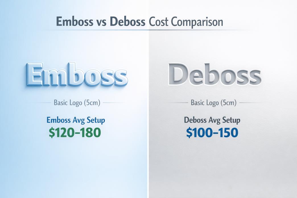
Emboss vs Deboss Cost Comparison
Whats The Difference Between Emboss And Deboss In Design 3
When clients ask about the difference between emboss and deboss, the talk usually starts with looks and ends with cost. The real story sits in tooling, pressure, and material behavior. If you’re weighing emboss vs deboss for branding, this breakdown keeps it real and practical.
Understanding the Production Processes of Embossing and Debossing
The difference between emboss and deboss begins with how a die interacts with a substrate.
- Tool Creation1.1 Design Conversion
- Artwork is converted into a metal die.
- A matching counter-die may be produced for sharp relief.
1.2 Depth Planning
- Emboss requires raised impression planning.
- Deboss calculates indentation depth and surface tolerance.
- Pressing Stage2.1 Emboss
- Uses pressure and sometimes heat.
- Forces the substrate upward for visible relief.
2.2 Deboss
- Applies controlled pressure downward.
- Creates a recessed impression without tearing fibers.
- Quality Control
- Edge sharpness check
- Depth consistency measurement
- Surface stress review
The difference between emboss and deboss isn’t just raised versus recessed. It’s about mold pairing, alignment, and how evenly pressure spreads across the substrate. Brands like Topfeel fine-tune these micro-adjustments so emboss vs deboss results stay clean, even on detailed logos.
Cost Considerations for Customization: Emboss vs Deboss
When discussing the difference between emboss and deboss, cost usually comes down to:
- Tooling complexity
- Setup time
- Design size
- Higher complexity means deeper molds.
- Larger design size increases metal usage.
- Higher volume spreads setup and labor cost. In 2026, as efficiency rises to the surface as a top operational priority, brands are adopting more disciplined forecasting and AI-supported digital tools. This helps optimize tooling workflows and mitigates the setup costs for custom embossing dies across large production volumes.
The difference between emboss and deboss often shows in mold depth and finishing work. Raised logos may require extra finish polishing. Recessed marks may demand tighter setup alignment. At scale, emboss vs deboss pricing narrows, but small batches highlight the gap.
How Materials Affect the Cost of Embossing and Debossing
Material choice changes everything about the difference between emboss and deboss.
- Paper & Cardstock 1.1 Thickness Matters
- Thin paper risks cracking under pressure.
- Heavy cardstock holds deeper impression.
1.2 Durability
- Higher durability supports sharper emboss results.
- Leather and PU2.1 Natural Flexibility * Softer leather absorbs pressure smoothly.
- Thick PU increases mold strain.
2.2 Surface Recovery
- Deboss holds shape longer on firm hides.
- Metal and Plastic * Require calibrated heat.
- Higher thickness equals higher tooling stress.
The difference between emboss and deboss becomes clearer once material enters the mix. Flexible surfaces react differently than rigid ones. That’s why Topfeel tests plastic, metal, and layered fabrics before full production. Smart material pairing reduces waste and keeps emboss vs deboss decisions cost-efficient.
3 Differences Between Emboss and Deboss
When clients ask about the difference between emboss and deboss, they usually want more than a textbook answer. The real story sits in touch, light, material feel, and production rhythm. Let’s break down the emboss vs deboss difference in a way that’s easy to grasp.

Texture and Design Impact: Emboss vs Deboss
Understanding the difference between emboss and deboss starts with surface behavior.
- Surface Direction
- Emboss → pushes material upward into a raised surface * Deboss → presses design downward into a recessed surface 2) Visual & Light Response
- Raised logos catch light reflection quickly
- Indented marks create subtle shadow effects * Both enhance visual depth, just in opposite ways
- Touch & Brand Feel
- Emboss: bold tactile experience, strong branding
- Deboss: smooth finish, controlled design elements, quieter tone
Now, in real production:
A. For statement branding
i. Deep embossing increases height variance
ii. Works well for thick substrates
iii. Strong shelf presence
B. For refined detailing
i. Debossing keeps surfaces flatter
ii. Maintains structural integrity
iii. Feels premium but understated
That’s the practical emboss and deboss difference most designers care about. At Topfeel, clients often test both finishes on the same logo to physically feel the difference between emboss and deboss before final approval.
Materials That Suit Embossing vs Debossing Techniques
Material choice heavily affects the difference between emboss and deboss in outcome.
Material compatibility depends on:
- material thickness * fiber density
- heat tolerance
Here’s a quick technical comparison:
| Material Type | Avg Thickness (mm) | Emboss Depth (mm) | Deboss Depth (mm) | Pattern Clarity (%) |
|---|---|---|---|---|
| paper stock | 0.3–0.6 | 0.2 | 0.15 | 88 |
| cardboard | 0.8–1.5 | 0.4 | 0.3 | 91 |
| leather | 1.2–2.0 | 0.6 | 0.5 | 95 |
| plastic | 0.5–1.0 | 0.3 | 0.25 | 86 |
| fabric | 0.4–1.2 | 0.2 | 0.35 | 83 |
Observations:
- Thick leather handles deep embossing best.
- Softer fabric responds more clearly to deboss pressure.
- Rigid plastic requires careful heat control.
So when comparing emboss vs deboss difference across materials, texture response shifts fast.
Production Time and Bulk Orders: A Key Difference
Production is where the difference between emboss and deboss becomes operational.
Workflow comparison:
- Tooling Stage
- Emboss → complex die creation for height control
- Deboss → simpler plate forming
- Setup
- Both require machine calibration * Emboss often needs longer setup time 3) Manufacturing
A. Emboss
i. Slower initial runs
ii. Higher mold precision
iii. Slightly reduced production speed B. Deboss
i. Faster repeat stamping
ii. Stable manufacturing process iii. Greater bulk efficiency 4) Timeline Impact
- Emboss may extend project timeline by 5–12%
- Deboss suits large-volume consistency
For brands scaling fast, this emboss and deboss difference affects cost per unit. That’s why Topfeel often recommends deboss for high-volume runs and emboss for flagship collections where that raised surface really needs to pop.
In short, the difference between emboss and deboss shows up in feel, material behavior, and factory rhythm. Once you run your fingers across both, the choice becomes pretty clear.
Bulk Orders? Optimize Emboss and Deboss Costs
Bulk production changes the game. When brands scale up, the difference between emboss and deboss is no longer just about style—it’s about tooling, timing, and cost control. Many buyers casually ask about the difference between emboss and deboss, but in high-volume runs, that difference affects everything from dies to delivery. If you’re comparing emboss vs deboss, or trying to fully understand the difference between emboss and deboss, this guide keeps it real and practical.

Die Cutting and Stamping for Bulk Embossing Orders
When production volume climbs, managing the difference between emboss and deboss begins with tooling strategy.
- Core production flow
- Tooling setup * Custom embossing dies designed around logo depth
- Adjusted for material thickness to avoid cracking
- Balanced against rising tooling costs in large production volume * Surface preparation * Pre-conditioning leather or PU for stable embossing process * Moisture calibration to keep raised logos sharp
- Execution stage * Precision die cutting to align edges
- Controlled stamping pressure to maintain even height
Emboss vs deboss decisions often look simple on paper. In reality, embossing pushes material upward, so thicker substrates demand reinforced dies. That’s where the true difference between emboss and deboss shows up in cost sheets.
At Topfeel, bulk embossing programs reduce per-unit tooling expense by standardizing die dimensions across collections. The result? Cleaner logos, tighter stitching alignment, and a smart balance between emboss and deboss cost comparison.
Molding and Assembly: The Cost-Efficient Route for Debossing
Debossing flips the logic. The difference between emboss and deboss here lies in pressure direction and cavity depth.
- Production structure
- Mold development * Precise mold design for recessed clarity
- Tested against different material selection options
- Forming stage * Controlled molding techniques to prevent edge warping
- Assembly line sync * Integrated assembly process to keep logo placement centered
- Optimized for higher production efficiency * Lower overall unit cost at scale
In simple terms, emboss raises; deboss presses down. That’s the physical difference between emboss and deboss. For soft leather totes, the debossing method often wins because recessed logos resist friction during shipping.
Brands that clearly understand the difference between emboss and deboss avoid rework and wasted molds. It sounds small, but over 10,000 pieces, pennies stack fast.
How Lead Time Affects Bulk Orders for Embossing and Debossing
Lead time management quietly shapes the difference between emboss and deboss outcomes.
- Design approval 1.1 Artwork confirmation1.2 Depth test samples
- Material procurement 2.1 Leather batch consistency2.2 Hardware color matching
- Production schedule 3.1 Allocating machine hours3.2 Tracking manufacturing duration
- Shipping logistics 4.1 Carton planning4.2 Port booking aligned with project timeline
Longer timelines allow repeated sampling, which is crucial when comparing emboss vs deboss texture results. Rush jobs blur the difference between emboss and deboss because pressure calibration gets rushed. Smart brands plan early.
Packaging and Quality Control: Maximizing Bulk Order Efficiency
Final inspection is where the difference between emboss and deboss becomes visible to the end user.
- Quality assurance * Depth measurement using calibrated gauges
- Visual check for pattern clarity
- Inspection protocols * Random sampling across cartons
- Surface rub tests for defect prevention
- Packaging solutions * Protective inserts for raised embossing
- Flat compression guards for debossed logos
- Shipping preparation * Moisture barriers
- Carton drop tests to protect product integrity
Process optimization ties it all together. Raised logos need cushioning; recessed marks need clean edges. Understanding the difference between emboss and deboss ensures brand standards stay tight from factory floor to retail shelf.
FAQs about Difference Between Emboss And Deboss
What is the difference between emboss and deboss on cosmetic bags? The difference between emboss and deboss lies in how the logo meets the surface.
- Embossing – created through Stamping or Molding, lifting the logo above PU Leather, Canvas, or Nylon.
- You feel the raised Texture instantly.
- Works well on exterior panels with Reinforced Stitching or near a Zipper Closure.
- Strong visual impact, especially with precise Die Cutting.
- Debossing – pressed inward, forming a recessed Pattern.
- Subtle depth on Velvet or Satin.
- Often chosen for softer finishes or near Interior Pockets and Lining.
- Relies on controlled pressure during Production to avoid distortion.
One stands proud; the other sinks quietly into the material—both speak through touch.
How do materials and production processes affect embossing and debossing results? Material choice changes everything—pressure, clarity, even mood.
- PU Leather & Nylon: hold sharp edges during Embossing; ideal for bold Shape definition.
- Canvas: needs deeper molds during Die Cutting for clean impressions.
- Velvet & Satin: highlight refined Debossing but demand careful Quality Control.
Production tension builds in three areas:
① Sampling & Prototyping – test depth before Bulk Production.
② Pressure calibration during Stamping – too light fades the Pattern, too heavy warps it.
③ Assembly & Packaging checks – confirm alignment with Hardware Finish and Tagging.
A slight misstep in Lead Time planning can blur a logo that was meant to be unforgettable.
How does customization influence the branding impact of emboss vs deboss? Branding lives in the details—Logo Placement, Color Matching, and Finishing decide the final emotion.
| Element | Embossing | Debossing |
|---|---|---|
| Visual Effect | Raised, bold | Recessed, understated |
| Best Pairing | Heat Transfer or Screen Printing for added Color Palette depth | Natural tone-on-tone elegance |
| Ideal Location | Front panel, above Zipper Closure | Near Lining or Water-Resistant surfaces |
| Cost Impact | Mold precision affects Bulk Production pricing | Pressure control influences Sampling time |
Embossing demands attention. Debossing rewards a closer look.
Choosing between them shapes not just the bag—but how your brand is felt in the hand.
References
- [McKinsey State of Fashion 2026 Report – https://www.mckinsey.com/industries/retail/our-insights/state-of-fashion]
- [2026 Label Printing Trends – https://www.sixb.com/blog/2026-label-printing-trends]


.png)
4th-5th Floor, Building B2, Yin Tian Industrial Park, Xi Xiang Road, Bao'an Dist, Shenzhen, 518102 ,China